
One question, asked of designers: has design got better?
36% said better. 35% said worse. 29% said the same.1
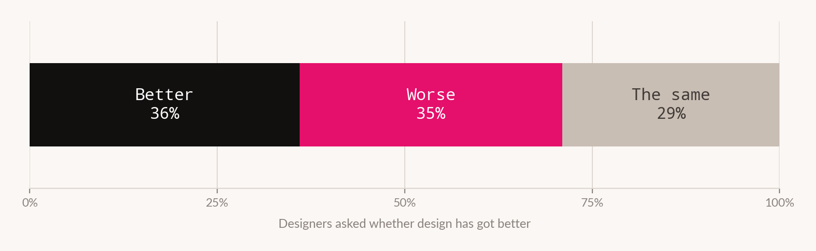
A one-point gap between "better" and "worse" is not a verdict. On any reasonable sample it is a tie, and a tie on this question is a more interesting result than either answer would have been.
Ask engineers whether software got faster and you get a number. Ask designers whether design got better and you get a coin toss. The difference is not temperament. It is that one profession has an agreed measure and the other does not.
What a tie actually tells you
There are three ways to read a 36/35/29 split, and they are not equally likely.
The first is that design genuinely got better for some people and worse for others - different sectors, different employers, different kinds of work. Plausible, and probably partly true.
The second is that respondents answered different questions. Some heard "is the craft better", some heard "is my job better", some heard "is the output in market better". The absence of published question wording means we cannot exclude this, and we flag it in Figure 01 rather than assume it away.
The third reading is the structural one. The profession has no agreed instrument for answering the question at all, so what the survey captured was not an assessment but a mood - and moods distribute roughly evenly in a population under pressure.
We think the third is the most useful, because it is testable against everything else on this desk.
The absence explains the rest of the edition
Five features precede this one. Each describes a problem that a shared quality standard would resolve, and that without one cannot be settled.
Read that last row again. The only enforceable quality criteria arriving in design this year came from regulators. A contrast ratio of 4.5:1 is a standard. A marking obligation is a standard. They are narrow, they are external, and the profession did not write them.
Why this profession in particular
It would be easy to read the split as ordinary professional grumbling. It is worth asking why design specifically lacks the instrument that neighbouring disciplines have.
Performance marketing has cost per acquisition. Engineering has latency, uptime and defect rates. Copy has readability scores, however crude. These are not perfect measures and practitioners complain about all of them - but a complaint about a measure is a different condition from having none.
Design's difficulty is structural rather than cultural. Its output is judged on effects that are separated from it in time, mixed with other causes, and often not measured at all. A layout contributes to a conversion rate alongside the offer, the price, the traffic source and the season. Isolating its contribution requires exactly the kind of controlled comparison that Feature 16 shows most organisations cannot run past thirteen variants.
There is a second difficulty and it is the more interesting one. Much of what design does is avoid outcomes rather than produce them. A clear interface prevents confusion. A well-set page prevents abandonment. A correct contrast ratio prevents exclusion. Prevention leaves no trace in the data - the support ticket that was never raised does not appear in any system - and a discipline whose value is largely in absences will always struggle to demonstrate it.
Design is measured on what it produces and paid for what it prevents. The gap between those two is where the argument about quality lives.
The consequence inside an organisation
An unmeasured discipline does not become unmanaged. It becomes managed by proxy, and the proxies are worse than the thing they replace.
In the absence of a quality standard, creative decisions get resolved by seniority, by volume of stakeholder opinion, by whoever briefed the work, or by what resembles a competitor. None of these is a judgement about the work. All of them are stable, repeatable and defensible in a meeting, which is precisely why they persist.
This is also the mechanism by which the effectiveness gap in Feature 13 becomes possible. Award juries and consumer testing produced different orderings of the same films - but an organisation with no standard of its own has no basis to prefer either, and will default to whichever is more socially useful. Awards are more socially useful.
What the profession is being asked to do instead
The sentiment research describes designers as taking on a wider remit - moving into ambiguity rather than away from it.1 Read alongside Feature 18, that expansion has a specific shape.
Feature 18 found the scarce capabilities to be brief-writing, editorial judgement at volume and constraint design - none of which appear in job specifications, all of which resist description. Those are the capabilities of someone deciding what should exist, not someone executing a decision already made.
That is a promotion in substance. It is also a promotion into exactly the territory where the missing instrument bites hardest. A discipline moving upstream into judgement, without an agreed way to evaluate judgement, is taking on more responsibility and less defensibility at the same time.
We do not have data on how that resolves. Nobody does - the transition is roughly two years old. But it makes the case for a written house standard more urgent rather than less, because the alternative in an ambiguous remit is not neutrality. It is seniority.
The sentiment data does not resolve it
Designers are not, in general, gloomy about the tooling. 67% view AI as a complement rather than a replacement. 91% say AI tools improve their designs.1
Hold that against the split in Figure 01 and something does not sit.
Ninety-one per cent report improvement in the thing in front of them. Thirty-six per cent report improvement in the thing overall. That is not a contradiction - it is what you would expect when individuals can assess their own work and nobody can assess the whole.
It also has a less comfortable reading, and we cannot distinguish between them: it may be what a population looks like when everyone believes their own output improved and is looking at everyone else's.
Whose research this is, and ours
This sentiment data is published largely by Figma, which sells design tooling and has an interest in designers reporting that new tools improve their work. We have used the figures because they are the only systematic sentiment research in the category, and marked the interest rather than absorbed it. Our own position is worse, not better: Marketing Legendary sells creative work and this feature argues that judgement is scarce and unmeasured. That is a convenient thing for us to argue. The reader should discount accordingly - which is, in miniature, exactly the problem the feature describes.
What would actually settle it
We are not going to propose an industry standard for design quality. Attempts at that have a poor record and we have no evidence any of them worked.
What can be said is narrower and more useful: the question is answerable at the level of a single organisation, and almost nobody answers it.
A house standard is not a definition of good design. It is a statement of what this organisation is trying to make happen, specific enough that a piece of work can fail it. Most creative organisations do not have one, which is why creative review so often resolves into whoever is most senior in the room.
What to do about it
Write down what your organisation thinks good work does. Not adjectives - effects. What should a viewer understand, feel or do. A standard that cannot be failed is not a standard.
Separate craft assessment from outcome assessment, and run both. Feature 13 found expert judgement and consumer response producing different orderings. That is information, not a problem, provided you stop treating either as a proxy for the other.
Use the external standards you have been given. Contrast ratios and marking obligations are the only agreed criteria in this edition. They are narrow, but they are testable, and a team that meets them reliably has more shared standard than most.
Measure inside your ceiling and accept judgement above it. Feature 16's arithmetic tells you where evidence stops. Beyond that point, decisions are made on taste - and a team that names that explicitly makes better decisions than one that pretends the data continues.
Stop citing the split as bad news. A profession divided on whether its output improved is a profession without an instrument. That is a solvable problem locally and it does not require anyone to agree with anyone else.
| Measure | Value | Note |
|---|---|---|
| The profession's own verdict | ||
| Design has got better | 36% | Reported |
| Design has got worse | 35% | Reported |
| Design is the same | 29% | Reported |
| Gap between better and worse | 1pt | Our arithmetic |
| On their own tools | ||
| Say AI tools improve their designs | 91% | Self-reported |
| View AI as complement, not replacement | 67% | Self-reported |
| The only external standards arriving | ||
| WCAG 2.1 AA contrast and operability | Enforceable since 28 June 2025 - Feature 15 | |
| AI content marking | Binds 2 August 2026 - Feature 19 | |
How we did this
What this doesn't prove
- That design has or has not improved. The feature argues the profession cannot answer this. It does not answer it either.
- That respondents interpreted the question consistently. Without published wording we cannot exclude that the split reflects three different questions being answered.
- Sample size or margin of error. Unavailable to us. A 36/35 gap may be well inside sampling noise, which would strengthen rather than weaken the reading offered here.
- That a shared standard would improve outcomes. Plausible and untested. Professions with agreed measures also optimise toward them, sometimes badly.
- That house standards work. We recommend them on reasoning, not evidence. No research we found tests whether organisations with written creative standards produce better work.
- That design is harder to measure than neighbouring disciplines. The prevention argument is reasoning about the nature of the work, not a comparative study of measurability across professions.
- That proxies like seniority actually dominate creative decisions. This is our characterisation of how unmeasured disciplines behave. We found no research observing creative decision-making in organisations.
- That the 91% and 36% figures come from the same respondents. They appear in the same body of research but we cannot confirm they are the same sample, and the comparison in the twin panel assumes they are.